The Beginner’s Guide to Online Donations
Get Online Donations with Your Website, Newsletter & AdWords Ads
Landing Pages that Convert & Optimized Keywords: Chapter 5
Nonprofits: Learn how to mine keywords from Internet search terms that your potential donors use and about the importance of landing pages in converting casual visitors into committed supporters. Begin creating your own collection of time-saving templates with this guide: 12 Steps to Building a Perfect Landing Page Template.
 |
The Beginner’s Guide to Online Donations. CSDi is offering a complimentary nonprofit book on online fundraising. Boost your donations in 14 weeks: 
|
Each of the 14 chapters include 3 step-by-step guides that lead you in setting up a modern website, launching a donor newsletter program and applying for a $10k/mo Google AdWords Grant. See what the 42 guides include. |
Today we are presenting the full version of Chapter 5 so you can get started driving the right people to your website and perfecting their experience.
Chapter 5. Landing Pages that Convert and Optimized Keywords.
Here is a quick summary of the 4 steps in the chapter:
Tab 1. The Importance of Landing Pages and Keywords: Overview of Chapter 5.
Tab 2. Guide 13. Keywords and the 21st Century Communication Secret.
Tab 3. Guide 14. Landing Pages are Your Salesmen.
Tab 4. Guide 15. 12 Steps to Building a Perfect Landing Page Template.
Chapter 5 is set-up for you in the 4 tabs just below.
Landing Pages that Convert and Optimized Keywords: Time Requirement.
- Overview: 15 minutes.
- Landing Pages: 1 Hour.
- Keywords: 1 hour.
- Checklist: 45 minutes.
Total Time for Chapter 5. Three Hours. In this chapter you will learn how to find the keywords you need to attract donors to your website. You will also complete your first landing page (started in Chapter 3) and fine tune it with our 12 Step Guide to Building a Perfect Landing Page.
Get free access to the Beginner’s Guide to Online Donations here. Each of the 14 chapters includes 3 individual, step-by-step guides to boosting online fundraising: 42 guides in total. See the syllabus. |
|
Chapter 5 is set-up for you in the 4 tabs below.
Links for Landing Pages that Convert & Optimized Keywords:
CHAPTER 5 OVERVIEW. Landing Pages that Convert and Optimized Keywords. The importance of landing pages and keywords.
This week in Chapter 5 we’re going to learn ways of finding the right keywords for your programs, we’re going to analyze what good landing pages should include, and we’re going to use a checklist for completing your first professional landing pages.
Guide 13. Keywords and the 21st Century Communication Secret.
In the first section of Chapter 5, we will learn that landing pages have two different jobs to do. One is to lure people to your webpage (connecting the two of them together), the other is to give them a way to fulfill their search (call to action). They’re both absolutely essential. We will also learn to use the way your potential donor writes their search queries—and use those search terms as our keywords. This is called the Voice of the Customer (VOC).
Guide 14. Landing Pages.
This week we’re going to take the landing page that we began developing in Chapter 3 and expand upon it.
Above the fold (the fold is the bottom of your computer screen) we put the important, immediate information to let a visitor know that 1) they’re on the right page, 2) we have the quality product they’re looking for, 3) they have a call to action to respond to immediately, or 4) they realize this is definitely interesting but that they need to learn more before making a decision.
Guide 15. 12 steps to building a perfect landing page template.
Just look at this month’s simple landing page template and simply use the 12 steps below to customize it for your organization.
Get Going!
So now, click on the second tab to learn about finding the perfect keywords your site. Click on the third tab to learn all about landing pages. And click on the fourth tab to see a step-by-step checklist for your new landing pages.
Next week, in the next chapter (Chapter 6), we’re going to optimize your landing pages with simple SEO so that potential donors find you.
Enjoy. See you next week.
CHAPTER 5. Landing Pages that Convert and Optimized Keywords. The importance of landing pages and keywords in accepting donations.
Guide 13 Keywords. Keywords and the 21st Century Communication Secret.
Please note: this will be a comprehensive overview of how to find keywords.
Keywords for Landing Pages
Landing pages have two different jobs to do. One is to lure people to your webpage (connecting the two of them together), the other is to give them a way to fulfill their search (call to action). They’re both absolutely essential.
Keywords are the tools that provide the lure to get people from an Internet search to your website.
Keywords and landing pages are a bit hand-and-glove. Consequently, there will be a little bit of an overlap between Guide’s 14, 15 and 16. I would consider working on one simple landing page during these four assignments – as one assignment builds upon the other.
Connecting with Supporters
This week, in Chapter 5, we are going to be looking at the cornerstone of all digital marketing. This is the intersection between what people are looking for and what you have to offer. It is making the vital connection between exactly how they ask for what they’re looking for and exactly how you portray what you have to offer. This is what Google, Bing, and Yahoo do. Period.
For simplicity let’s say that what a potential customer types into a Google Search is called a ‘search term.’ “Donate to a food bank.”
If you feel that specific search term could be beneficial tou you and, for example, you include “Donate to a food bank” on your landing page: we will call that a ‘keyword.’
If you have a food bank in Claremont, California, and a person looks for a food bank in Claremont by Googling the search term “food banks in Claremont California,” and you have a landing page called “Food Banks in Claremont California” there is a good likelihood that your webpage will appear in that individual’s Google search results.
We looked at using Yoast in Chapter 2 to help us make sure that (in this instance) your focus keyword (Food Banks in Claremont) is 1) scattered a meaningful number of times in the landing page’s content, 2) is in the page title, 3) is in the header, 4) is in the meta-description, and 5) is in the page’s URL. By optimizing your SEO in this manner, you will increase your chances of appearing in first page search results.
However, this is a fool’s folly if you haven’t first clearly identified what you are offering, and even more clearly identified what search terms people use who are looking for what you are offering.
For example, if a number of people are using the search term “free food in Los Angeles County” and your focus keyword for your landing page is “Food Banks in Claremont,” the vital connection between the searcher for free food and your food bank may not be made.
If we make the assumption that what this person is looking for is indeed exactly what you have to offer, but are using different search terms (than the keywords that appear on your landing page) to find what they are looking for, but are using different search terms (than the keywords that appear on your landing page) then you may need to modify your landing page’s focus keyword to better match their search terms.
An example could be that in your part of the country the term “food pantry” is more common than “food bank.”
Due to be exacting nature of connecting on the Internet, it’s really very important to fully distill what a new landing page is about. A good place to start could be a sound bite of what you are offering on that page (free, weekly emergency food packages for people in need in the Claremont area), perhaps described in several ways (food pantry vs. food bank), and then modified to best fit how a potential client or donor might describe it.
A good description can help prevent developing two landing pages that are too similar to each other. Not much help when you’re trying to sell one concept over another with a specific keyword.
A good description can also help you “uncover” the focus keyword for that page.
A really good sound bite can become your meta-description for your landing page.
Step One.
The first thing that I would suggest doing is to develop a simple plan of your website, the landing pages that you hope to develop, and potential ‘placeholder’ focus keywords.
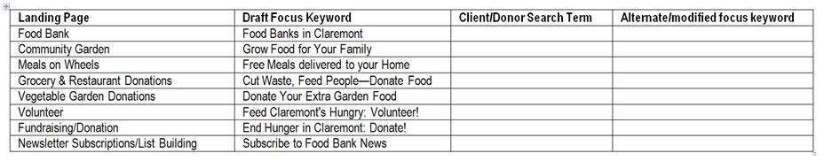
So let’s say that your organization has eight programs:
- a food bank
- a community garden
- Meals on Wheels
- a restaurant and grocery store donation program
- a homeowner vegetable garden donation program
- a volunteer program
- a fundraising program
- a monthly newsletter
Let’s look at those eight programs as if they were eight potential landing pages:
This week we’re going to focus on developing keywords for one of these landing pages. The idea is to learn the whole process for developing keywords for effective landing pages before developing additional landing pages.
However, mapping out your programs and services like this is a really good exercise. It might help you to prioritize which landing pages to begin with. It can also help you see if you have focus keywords that are repetitive: in other words, you want each program’s landing page to have distinctly different focus keywords.
It also begins the process of thinking about: how do we describe what we do in a few words. If this is a sound bite about what you do: “Free, weekly emergency food packages for people in need in the Claremont area,” how will you turn that into a focus keyword of two or three or four words?
Step Two.
So let’s say we are going to focus on the food bank newsletter subscription idea that we initiated in Guide 30.
Start with your Newsletter’s sound bite:
‘Learn How we solve hunger in Claremont—and how you can participate in the solution too—in this informative monthly newsletter.’
You can even work on generating a page description for additional ideas:
“Use your people skills: End hunger in Claremont. Join a new community of doers, make new friends, support and encourage people who are hungry. Meet the families in need and learn how special volunteering can be at our food bank by subscribing to our people centered newsletter.”
Make a list of three or four potential focus keywords. We’re going to use these to look for the search terms that your potential clients use. Write these as if they were being written by someone hoping to help end hunger in Claremont.
- Subscribe to Claremont Food Bank News
- How to end hunger in Claremont
- Claremont families in need of food
Step Three.
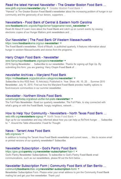
If you’re stumped, here are five ideas that you can use to get started: Visit the websites of other food banks to get newsletter subscription keyword ideas.
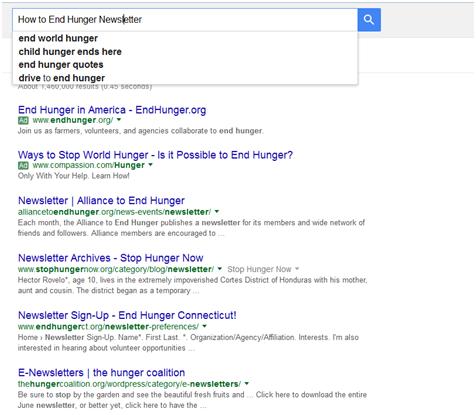
Use your draft keyword options above and enter them one at a time into a Google search. There are half a dozen ways that you can learn more about customer search terms. I entered: “Subscribe to Claremont Food Bank News,” and then narrowed it down to “Subscribe to Food Bank News.”
Idea 1. When you’re entering your keywords into the little search box in the upper left, you’ll see a drop-down menu appear. Those are actually search terms that people have used for what you’re typing in. Make note of some of these rich ideas: this is the real deal!
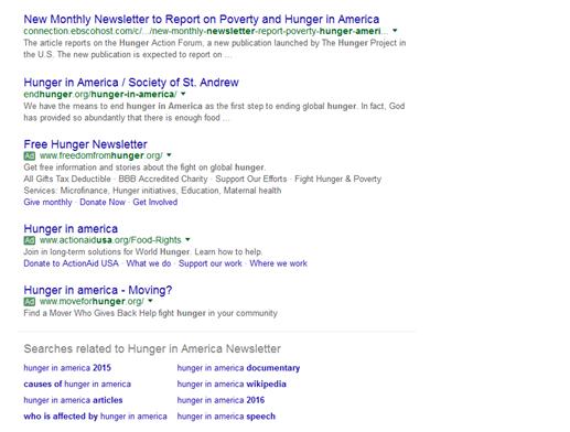
Idea 2. After you have entered your search, scroll down to the very bottom of the page and you will see (in blue) about 10 additional search terms that people have actually used that may help you choose focus keywords.
Idea 3. At both the very top and bottom of the search results will be Google AdWords ads (you can see them in the illustrations above). Many times the organizations writing these ads have hired expert consultants to write them and have also tested which ads are the most effective. Make note of key phrases within these ads as well—because they may be working very well for other organizations similar to yours. They can work well for you too!
Idea 4. In a similar fashion, Google’s page one search results are the most effective results as determined by Google. These may also have been professionally written and tested as well. It would be wise to note keywords that you spot that could be useful for you.
Idea 5. If one of the search results looks particularly applicable to your program and landing page, click on it. Read the landing page looking for keywords. Read the heading at the top of the page and make note of what it says. If it seems like there’s a keyword tucked into the heading—look in the first paragraph and see if the same keyword exists there too. This may indicate that this is their focus keyword.
Look at the URL of the page you’re on and see if the keyword is within the URL too. Always a good clue to look here.
While on the page, you can hit “control f” and enter the keyword you’ve spotted—and see if it appears a number of times within the page itself.
Tech Tool: This is a lot of information! Do you remember in the second chapter I suggested that you create a folder in a series of files for each one of your landing page themes. So for example, right now, create a folder on your hard drive for Food Banks [or the subject of your main interest].
Open an Excel spreadsheet and title it ‘Subscribe to Food Bank Newsletter Keyword Google Search.’ Put today’s date in the upper left corner.
Paste in your initial focus keyword ideas at the top.
Type in new keyword ideas that you found during the five activities above.
Also, if you find web pages that you like—copy/paste their URL so you can find them again.
If you see a good search result that is appealing to you, select it, copy it, and paste it into the Excel spreadsheet.
If you see a Google AdWords ad that is appealing to you, select it, copy it, and paste it into the Excel spreadsheet.
Within 15 or 20 minutes you can have quite a collection of donor generated search terms and competitor generated keywords that address those search terms. Boom.
Save this Excel spreadsheet to your food bank folder that you are using to save this information. Over the next few months you will refer to it over and over again, add information, quantify the information you have, and even add additional sheets for different types of information.
Finally, another great way to find out what people are looking for, is to look for blogs or Facebook pages or forums like Google + where your potential clients and donors visit and leave comments. It’s quite amazing how well they express themselves in a very short sound bite about challenges they are facing and what they’re looking forward to solve them. Note these on your Excel spreadsheet also—and where you found them.
Step 4. Modify Focus Keywords.
Here is the list from step two of potential keywords with potential alternatives found using the techniques above:
Subscribe to Claremont Food Bank News
- Subscribe to Claremont Food Bank News
- Claremont Food Bank News
- Learn about Claremont Food Banks
- Claremont Food Newsletter
- Newsletter Subscription – Claremont Food Bank
- Online Newsletter – Claremont Food Bank
- News – Claremont Area Food Bank
- Read the latest Food Bank Newsletter
- Newsletters | Claremont Food Pantry
How to End Hunger in Claremont
- End Hunger in Claremont
- Hunger in California
- Learn about Hunger in Claremont
- End Hunger in Claremont
- How Can I Help Food Banks
Claremont Families in Need of Food
- Sponsor Families in Claremont
Step Five.
Advanced Techniques
There are ways to find the actual search terms that people are using that send them to your website. Here are some ideas:
- Google Webmaster (now called Google Search Console) provides something called ‘Search Analytics’ which lists the search terms potential clients have used to reach your website.
- Google Analytics has a similar service called ‘Queries.’
- Google AdWords has a similar service called ‘Search Terms’ which lists the search terms that people used in Google to make your AdWords ad appear. [You need to have an AdWords Grant to do this].
- Google AdWords Keyword Planner. You can enter a competitor’s website and see what keywords Keyword Planner finds. A goldmine for finding keyword ideas when you are getting started..
These three Internet services are more sophisticated than doing a simple Google search as in steps two and three. However, as your skills progress, these four services show you the very search terms that people used to specifically find your ad or your landing page.
If you are set up with these services: check them out! If you aren’t, these will be covered in great detail in Chapter 14, Guide 42.
|
Additional Insights.
What I’ve learned about searching for food bank newsletter keywords.
In researching keywords for nonprofit newsletters and food bank newsletters using the techniques that we’re exploring here, I found some mixed results.
The reason that I’m bringing this up is that this happened sometimes. You have a concept or product you’re trying to promote about your nonprofit and when you begin researching keywords—you aren’t satisfied with the results. So here are some tactics to move through this challenge.
NB: Please bear in mind that the food bank newsletter example is just an example. The landing pages that you are working on may be on a different subjects entirely. However, the following solutions will be just as applicable to you.
Solutions. If in entering your draft keywords you don’t immediately find promising search results such as (in my case) “Subscribe to Claremont Food Bank News” look carefully at what you are seeing and try to uncover a theme.
I discovered four things.
1. Organizations promoting their newsletters didn’t necessarily come right out and say “Subscribe!” They worked with a compelling theme as their page title (your page title becomes the link that you see in the Google search results):
How to End Hunger in Claremont
When someone clicks on this link in the Google search results, they are taken to a landing page about subscribing to a newsletter that will help them learn how to end hunger in Claremont.
So, on the landing page the person exploring hunger in Claremont learns about several of the ways that the food bank works to solve hunger in Claremont—but then they are also encouraged to subscribe to a newsletter that will help them continue this learning experience.
Some of the organizations added something to the end of the page title indicating newsletters:
- How to End Hunger in Claremont | Newsletters
- End Hunger in Claremont | Learn More in our Newsletter
- How to End Hunger in Claremont | Learn through our Newsletter
Another way to look at this is that since each landing page needs a call to action, the “End Hunger in Claremont” landing page’s call to action is “Subscribe!” To fulfill the promise you made in your search result “How to End Hunger in Claremont” you need to make sure that you answer the individual’s questions—and then give them an opportunity to receive more information through a subscription.
2. A second way that I saw organizations successfully getting around having a search result that says “Subscribe to Our Newsletter!” is to make the name of their newsletter incredibly compelling and a focus keyword all in itself:
- End Hunger News
- Hunger in California | The Claremont Food Bank Newsletter
You can look for compelling terms with some of the keywords that you’ve been investigating on your Excel spreadsheet. Here are some examples that are general and related to food banks:
- food banks in Claremont
- food pantries in Claremont
- free food in Claremont
- free food in Los Angeles
- free food for families
- help with free food
One clue is this: many times when I’m searching Google for keywords for a landing page for a new product or service I often find search results that are very professionally done—and AdWords ads that are very professionally done. This would imply to me that other companies and organizations have discovered that people are indeed looking for these products and services and invest time in crafting a captivating page title and compelling page description.
I didn’t see much of this in my keyword search around food bank newsletters. This could explain Number 4 just below—where many people weren’t careful with crafting their page titles and page descriptions about their newsletters.
So my conclusion from this is that people searching the Internet for subjects surrounding a food bank concept (or whatever your organization’s program is) may be looking for ways to solve a problem that they find painful to see.
Because of this, I am more tempted to develop a landing page that addresses a solution to a problem, or offers to help the visitor learn more about solving a problem—and then have the call to action be “Subscribe!”
So you kill two birds with one stone here: you fulfill an Internet searchers quest for participating in a solution with a compelling landing page—and your goal of building your email list with a reason to subscribe.
4. Something really, really interesting that I observed while was doing these keyword searches on Google, is what a poor job many people do on their SEO page titles and meta-page descriptions and URL addresses.
One search result that I saw—when I clicked on the link didn’t lead me anywhere that had anything to do with newsletters or subscriptions—even though that’s what the link was about.
Here are some examples of organizations that didn’t craft informative, captivating page titles nor compelling meta descriptions in Yoast. Because of that, Google just pulled random text from their page:
Our Lady of the Assumption – Claremont CA : Outreach
www.olaclaremont.org/cgi-bin/complex2/showPage.plx?pid=202
OLA provides all the food for the Claremont Community Meal hosted at … The meal is served between 3 and 4:30 p.m. to families at risk or homeless. …. In solidarity with the poor and vulnerable, it responds to their material and spiritual needs.
News & Events | Alliance to End Hunger
alliancetoendhunger.org/news-events/
The easiest way to keep up with recent happenings at the Alliance to End Hunger is to … Check back regularly to discover the Alliance’s latest news and events.
St Faustinas Gate – Food Bank of WNY
www.foodbankwny.org › … › Our Pantry Listing
Food Bank of Western New York
St Faustinas Gate. Pantry. Address, 263 Claremont Avenue Tonawanda … Sign up for our e-newsletter. Sign Up. Manage your e-mail subscription. $$Name$$
Newsletter Sign-Up – End Hunger Connecticut!
www.endhungerct.org/newsletter-preferences/
Home › Newsletter Sign-Up. Name*. First Last. *. Organization/Agency/Affiliation. Interests. I’m also interested in hearing about volunteer opportunities …
However, here is a good example of a compelling page title and a compelling meta description that someone put some thought into:
Blog & News | No Kid Hungry | End Child Hunger in America
https://www.nokidhungry.org/blog
Share Our Strength. Come Work With Us at No Kid Hungry. In every community across the United States, children are struggling with hunger. Their lives and futures are at risk.
|
This week’s chapter introduction was a little more detailed than normal because of the incredible importance of this week’s chapter. I wanted to show you the entire three-dimensional process of finding customer-centered keywords rather than just give you a simple overview.
So click on the next tab, Tab 3, called ‘Landing Pages’ to find out exactly how to use these rich keywords that you have unearthed.
CHAPTER 5. Landing Pages that Convert and Optimized Keywords. The importance of landing pages and keywords in accepting donations.
Guide 14 Landing Pages. This week we’re going to take the landing page that we began developing in Chapter 3 and expand upon it.
The first thing that I would suggest is to make sure that (while you work on it) you save this new landing page as a draft: don’t publish it. We’re going to be making a number of changes, and in the next chapter are going to be fine-tuning the landing page’s SEO which will include improving the page title, the page description, and possibly even the URL.
Essentially, landing pages are designed to (on the one hand), answer people’s questions, and (on the other hand), get them to make a commitment. For a nonprofit, this could be a donation, a subscription, or applying for a volunteer position.
You will need to analyze how demanding you want your landing pages to be. For example, if you are in a highly competitive business selling computer components like NewEgg.com or TigerDirect.com—you would try your hardest to get a commitment right now—rather than let a potential buyer wander off to another site.
On the other hand, your nonprofit might not need to be so demanding—but that is a decision that you will need to make.
The Blink Test. If you do a good job with your keywords, your page title, and your meta-description, then people who click on a Google link to your website based upon their Internet search will go to your site because you are offering something they want. The blink test means that upon landing at your web site they can find out in five seconds or less if your website is the right site for them.
So the search results that they see for your site need to be absolutely parallel with what they find on the landing page—or they will leave and go look at someone else’s website.
The range between immediate and deferred gratification.
If you pass the blink test, the next stage is to let your visitor see that your site has the quality they’re looking for.
If you’re a well-established organization like Kiva—people are purposefully going to your site because they want to make a donation. People will specifically go to VolunteerMatch because they’re looking for somewhere to volunteer. Because of this, these two organizations can get right to the point and ask you to donate or volunteer right off the bat.
Organizations like Kiva and VolunteerMatch don’t want to provide visitors with too many options less they get distracted and don’t commit to a donation or volunteer post. The classic example of this is a webpage that links to YouTube videos from their site. A visitor clicking on a YouTube video might wind up watching several videos and forget all about the fact that they started this adventure at your site.
However, if you’re from a smaller nonprofit, visitors might want a little bit more information before making a decision to donate to your nonprofit. This is something that your organization needs to explore: the range between an immediate call to action and a few options where people can develop the comfort level they need prior to making a decision.
Amazon does this successfully. When you search for a book, everything that you need to make the decision to purchase that book is right at the top of the webpage. However, Amazon doesn’t want to lose you if the book isn’t quite right. And so they offer you different pricing options—such as a less expensive used copy of the book. They offer you customer reviews of the book (credibility!), and they also offer you some options entitled “Customers Who Bought This Item Also Bought.”
This works for Amazon, but you can bet they’ve spent years testing and refining having additional options for customers to choose from.
Our Approach.
Above the fold (the fold is the bottom of your computer screen) we put the important, immediate information to let a visitor know that 1) they’re on the right page, 2) we have the quality product they’re looking for, 3) they have a call to action to respond to immediately, or 4) they realize this is definitely interesting but that they need to learn more before making a decision.
So what needs to be above the fold?
1. A Headline. The headline should match (or closely match) your page title which shows up on the search results. This will let the visitor know that they are on the right page. The headline should also be compelling enough to encourage a visitor to read more. Your headline should also contain your focus keyword.
2. A Sub Headline. The sub headline should succinctly provide additional information about what the visitor will find on the webpage and how they can benefit.
3. An Image. It’s very popular right now to have a photograph or illustration on a webpage. Images do take up valuable real estate and if you need to convey a lot of information quickly you might need to use that space instead for text. On the other hand, a picture is worth 1000 words. So, if you have organizational photographs which can let people know in a heartbeat what your organization does—by all means include a photograph.
4. An Introductory Message. This can be a short sentence or two which describes in greater detail what this webpage is about. It should be compelling and draw a visitor deeper into the concept you’re trying to convey. This introductory message should also contain the focus keyword. The introductory message can also turn into your meta-description (which you will write in next week’s SEO chapter) which shows up beneath your page title on your search results.
5. A Call to Action. If the purpose of your landing page is to get a visitor to subscribe to your newsletter, then right up at the top you want to have a very visible subscribe button or subscription form. If a person visited your site because they were excited about receiving additional information from you—then give them the opportunity to subscribe right away.
6. The Offer. Let them know in a few brief bullet points what you have to offer them. If you want them to subscribe, perhaps the offer is a free guide lets them know everything they need to know about hunger in your city—and how to solve it. The offer might be less tangible: the benefits of helping hungry people in your community.
7. The Benefits. The benefits of accepting your offer lets the visitor know quickly “what’s in it for them.” The benefits are why people make the decision to accept an offer. If they’re little undecided, then they can read about the features of your offer that will allow them to feel comfortable about their decision.
8. Credibility: Social Proof. A quick quote can let a visitor see immediately that other people have accepted your offer and have been happy with the result. This quote can be from a happy program beneficiary, from a happy donor, or from a fulfilled volunteer.
THE FOLD.
That’s a lot of information to get onto a single computer screen. You might need to play around with this and put some of the landing page components below the fold.
Two-Step Landing Page Solution
So one thing that we found works well for us is a two-step landing page. What we do near the bottom of the fold is to put in a series of horizontal tabs with additional information. Ideally (depending on the size of a visitors screen) this row of horizontal tabs would appear just above the fold, but the information they contain would be below the fold.
So in this week’s example landing page we have five tabs:
- more information
- testimonials
- how to subscribe
- how to volunteer
- how to donate
The way that the tabs work is that the first tab is open and visible as the visitor scrolls down. So whatever we were unable to fit in above the fold we can add it into the first tab and it appears simply like a continuation of the main page. The beauty of this is that they get to see both the continuation of the main page but also the horizontal row of tabs with additional information. That looks like this:
Please bear in mind that I annotated the example landing page in red. These annotations take up quite a bit of room which means that a real landing page would take up less space above the fold. Also, just as a reminder, I am not the director of a Claremont Food Bank. This is simply an example.
Several interesting things to point out about the landing page.
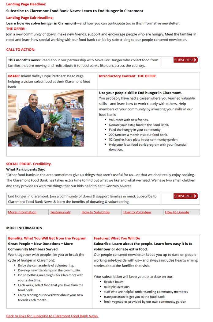
The image is good because it actually is a photo of people in a food bank in Claremont. So it’s both relevant and gives the visitor a fair amount of information. But it does take up space and that meant that we had to move benefits and features down below the fold.
We have a call to action button the upper right (Subscribe). We also have a second subscribe button near the fold. Each button has a slightly different compelling reason for subscribing.
Just below the second subscribe button, is the row of tabs where a visitor wanting to know more information can learn about subscribing, volunteering, or donating. So for example, they can learn what volunteer positions are open, and what sorts of donations we accept (cash donations or food donations).
Another nice thing about the tabbed system is that by clicking on the different tabs they don’t actually leave the page they are on. So all of the information above the fold is still there—they aren’t being distracted from subscribing by being taken to different webpage about a different subject.
The tabs that you can see are simply links to a different location on you page. So if you have a link that says ‘Testimonials,’ but the testimonials are at the bottom of your landing page—clicking on the testimonials link will quickly take you to the bottom of the page where the testimonials are.
How to install Anchor Links on your site.
Part 1. A simple single anchor link.
Step 1. Near the top where you want to create your first anchor link enter this html code – you can just copy and paste:
<div><a name="TOP"></a></div>
Step 2. Just below TOP enter your first link. It should contain your page’s URL and your anchor’s name:
<div><strong><a style="color: red; text-decoration: underline;" track="on" href="https://nonprofit.csd-i.org/subscribe-to-claremont-food-bank-news/#INFORMATION">More Information</a></div>
Step 3. The actual anchor. Just above your More Information section in the main part of your website, enter:
<div><a name="INFORMATION"></a></div>
Step 4. At the end of the More Information section enter:
<div><strong><a style="color: red; text-decoration: underline;" track="on" href="https://nonprofit.csd-i.org/subscribe-to-claremont-food-bank-news/#TOP">Back to links for Subscribe to Claremont Food Bank News.</a></strong></div>
So this is how to create a single link to somewhere in your web page.
Part 2. Multiple Anchor Links in the Form of Tabs.
If you want to set up tabs like in the illustration below follow this. You can copy and paste this into your landing page and fix the URLs. It will create a table of table tabs. Just below you can see the first link:
Insert this table just below where you placed your first "Top"
<div><a name="TOP"></a></div>
<div><strong>Links for Subscribe to Claremont Food Bank News:</strong></div>
<table style="padding-left: 0px;" border="0" cellspacing="2" cellpadding="0">
<tbody>
<tr>
<td bgcolor="#E6E6E6" text-decoration: underline;" align="left" valign="top">
<div><strong><a style="color: red; text-decoration: underline;" track="on" href="https://nonprofit.csd-i.org/subscribe-to-claremont-food-bank-news/#INFORMATION">More Information</a></div></td>
<td bgcolor="#E6E6E6" text-decoration: underline;" align="left" valign="top">
<div><strong><a style="color: red; text-decoration: underline;" track="on" href="https://nonprofit.csd-i.org/subscribe-to-claremont-food-bank-news/#TESTIMONIALS">Testimonials</a></div></td>
<td bgcolor="#E6E6E6" text-decoration: underline;" align="left" valign="top">
<div><strong><a style="color: red; text-decoration: underline;" track="on" href="https://nonprofit.csd-i.org/subscribe-to-claremont-food-bank-news/#SUBSCRIBE">How to Subscribe</a></div></td>
<td bgcolor="#E6E6E6" text-decoration: underline;" align="left" valign="top">
<div><strong><a style="color: red; text-decoration: underline;" track="on" href="https://nonprofit.csd-i.org/subscribe-to-claremont-food-bank-news/#VOLUNTEER">How to Volunteer</a></div></td>
<td bgcolor="#E6E6E6" text-decoration: underline;" align="left" valign="top">
<div><strong><a style="color: red; text-decoration: underline;" track="on" href="https://nonprofit.csd-i.org/subscribe-to-claremont-food-bank-news/#DONATE">How to Donate</a></div></td>
</tr>
</tbody>
</table>
<div><a name="INFORMATION"></a></div>
So for example this is how we set up the tabs on this week’s example landing page:
[Example: anchor link=”More Information”]
And then underneath this single line of short code I added in the content that I want to be within that tab:
|
Benefits: What You Will Get Out of the Program
Great People + New Donations = More Community Members Served
Work together with people like you to break the cycle of hunger in Claremont:
- Enjoy the camaraderie of volunteering.
- Develop new friendships in the community.
- Do something meaningful for Claremont with your extra time.
- Each week, select food that you love from the food bank.
- Enjoy reading our newsletter about your new friends each month.
|
And it winds up looking like this:
So this really is a beautiful system. If you visit this example landing page you can see the page itself is quite short—so a visitor doesn’t feel like they need to read an encyclopedia to learn more.
It gets a row of tabs providing additional information above the fold in case the visitor feels the need for additional information. Several of the tabs are additional call’s to action. And visitors can find out additional information without the distraction of going to a series of new webpages where they might lose their original inclination to subscribe to our newsletter.
So go ahead and click on this week’s, Chapter 5, Tab Four to find out more detailed information about each of the components of landing pages. And then get busy and finish up your own landing page!
CHAPTER 5. Landing Pages that Convert and Optimized Keywords. The importance of landing pages and keywords in accepting donations.
Guide 15. 12 steps to building a perfect landing page template.
Important Background Concept: Use supporters’ language in your landing pages. Then, supporters will find you.
Just look at this month’s simple landing page template and use the 12 hints below to customize it for your organization.
The Offer
Your offer—your Unique Selling Proposition or USP—is made up of several parts of your landing pages including your headlines, landing page copy and your call to action—but is also reinforced by your benefits, features and testimonials.
Make sure your offer is compelling—and that it has a sense of urgency (join our food drive the first Monday of each month!).
Step 1: Your landing page headline.
The main purpose of your headline is to let people know that they have landed on the right page; they have found the answer to the question they entered into their Google search.
So if they do a Google search on food banks in Claremont, and see a search result for your organization, when they click on that, the headline should let them know that they have landed on a page that’s going to talk about food banks in Claremont. Your headline should match your page title and meta-description that they clicked on in their search results.
Step 2: Your landing page sub-headline.
The sub-headline should convey the value of what you’re offering and give additional information succinctly. It should briefly explain in detail the benefit to the visitor.
Step 3: Insert an image.
And image should reinforce the content of the landing page and speak to the visitors needs. It isn’t useful to show an image that isn’t related to your offer: best to leave it out. Theimage can be a video: some people feel strongly that this is a good way to speak to the visitor. Others feel this is a distraction from clicking on the call to action. Read through the resources that I have included near the end and decide for yourself. A solution here is if the video can be embedded on the landing page–so that they don’t leave the page.
Step 4: Landing page copy. Introductory content.
The copy on your landing pages needs to do several things. The landing page copy should relate to the keyword searches that visitors have made to find your site, should revolve around the theme of these keywords, and supply additional information about the specific service discussed in your search results (your meta description).
Craft your landing page copy and add it to your landing page template from last week.
Step 5: Benefits: Bullet Points (what visitors can expect to get).
Webpage visitors are scanners—not readers. Bullet points allow them to quickly grasp your offer.
A program’s benefits result from its features. However, benefits are “what’s in it for them?” Feel good. Personal satisfaction. New friends. The joy felt by feeding a hungry child.
Benefits are why people buy; features are what allow them to feel comfortable buying. The features give them a checklist that allows them to make the decision.
Your benefits section should let them know WIIFM (what’s in it for me?). Volunteering is a way to make new friends that will help reduce loneliness. Volunteering is a way to help structure one’s schedule to provide a sense of purpose. Volunteering is a way to do something meaningful to create a sense of self-worth. The volunteer program allows volunteers to select food items that a retired person might enjoy, but not normally splurge on buying for themselves.
The research that you did last week on VOC keywords should give you lots of ideas for benefits.
Normally, features would come before benefits. However, because visitors may only stay on your website for 5 seconds—let’s capture their hearts first. Then they can read a little bit more about the details in the in the feature section in the next 5 seconds.
Think of four benefits that your offer will provide and add them to this week’s template.
Step 6: Features (what visitors will actually do if they accept the offer).
Features are an actual physical property or a function of your program that enables your supporters to fulfill a goal. In this case: solve hunger in your community. Flexible hours, multiple locations, staffed by helpful, understanding members of the community.
Explain the program’s benefits in greater detail by describing your program’s features—but written in the form of a benefit statement. Provide important details about the program in a compelling, clear and concise message.
So features could be that there are volunteer positions available, scheduling is flexible, you’ll be working with other people, and you get to select a package of food to take home.
Step 7: Call to action.
In the upper right you need a button which clearly describes the next step. The button should tell users what’s going to happen when they click it. Pay attention to copy and create a button that the visitor will want to click. It should also stand out by using contrasting colors.
- Become a Volunteer
- Volunteer with New Friends
- Donate to the Food Bank
- Feed the Hungry in your Community
- Learn by Subscribing
- Be Informed: Subscribe
Make sure your instructions for the call to action are clear—people are in a hurry. “All we need are your first name and email address here.”
You may want to include a one-line offer to reinforce the CTA button.
So in my example for getting people to subscribe to our special food bank newsletter I could say something like:
“Join a new community, make new friends, help and encourage people who are hungry. Click here to learn how special volunteering is at our food bank by subscribing to our people-centered newsletter.”
Think of an action-packed saying and add it to the button on this week’s template.
BREVITY & VISIBILITY
YOU WANT TO KEEP ALL OF THESE THINGS ABOVE THE FOLD. IF YOU RUN OUT OF ROOM PUT THE FOLLOWING THINGS BELOW THE FOLD.
Step 8: Credibility. Social Proof.
Another great thing to do is to include a testimonial—a quote—from a happy beneficiary, from a happy donor, or from a fulfilled volunteer.
Blend the testimonials in with the surrounding content to reinforce the message.
Add a couple of quotes to this week’s template.
Step 9: Trust Emblems.
If you belong to any associations, have corporate partnerships, have received any awards, have been mentioned in the media—include their logos at the bottom of the landing page—perhaps even in the footer.
Add a couple of organizational logos to this week’s template.
Step 10: Proof Read your Copy and Test all your Links.
Even a small grammar error can erode confidence. A donate button with a bad link will lose donors.
Step 11: Efficient design and landing page processes.
Visitors should be able to quickly find what they’re looking for and move along through the processes easily and as fast as possible.
- simplify design and cut out text that isn’t directly to the point
- stop talking about yourself and let people know what benefits they are going to realize instead
- make sign up forms as simple as possible with as few fields to fill in as possible
- eliminate choices: don’t send visitors off to do something like watch a YouTube video which will distract them from clicking on the call to action. You could say ‘subscribe to our newsletter to learn about our new weekly, informative YouTube videos.’
- in a similar fashion, reduce (hide) the number of links on the landing page to further reduce distractions
- use images that support their moving onto the next step: converting
- the blink test: will your visitor be able to understand your offer and know what to do next in the first five seconds?
- include a thank you page that lets them know what’s going to happen next
- enable social sharing so that they can tell their friends about this exciting step they’ve just taken
Step 12: Mobile devices.
It’s now accepted that 60% of emails are read on smart phones and tablets. The screens are small and they might not load as quickly as a desktop computer. This has changed how landing pages work:
- landing pages should load quickly: people on mobile devices can be impatient
- be direct and concise: don’t use a lot of text that can be hard to read on mobile devices
- use large text and big buttons that can be easy to click on with a finger
- if you want people to call you—provide a clickable telephone number
- if your organization and services are local—let people know where you’re from
- keep forms very simple
Special Note:
Mobile devices over the past five years have really changed the landscape of planning for your website. A webpage now needs to be “responsive.” This means that when visitors with different sized mobile devices visit your website, the page will automatically adjust its size to best fit the mobile device.
Copyright © 2016, Tim Magee
In the next chapter (Chapter 6) we’re going to optimize your landing pages with simple SEO so that potential donors find you.
Enjoy. See you next week.
Get free access to the Beginner’s Guide to Online Donations here. Each of the 14 chapters includes 3 individual, step-by-step guides to boosting online fundraising: 42 guides in total. See the syllabus. |
|
Copyright © 2016, Tim Magee