
The Beginner’s Guide to Online Donations
Get Online Donations with Your Website, Newsletter & AdWords Ads
Chapter 2. Design a Website that’s User Friendly & Google Will Love
Nonprofits: Learn how to design a website. Organize pages and content to make it user friendly. Use simple SEO techniques to make it visible to Google.
 |
The Beginner’s Guide to Online Donations. CSDi is offering a complimentary nonprofit book on online fundraising.
Boost your donations in 14 weeks:  |
|
Each of the 14 chapters include 3 step-by-step guides that lead you in setting up a modern website, launching a donor newsletter program and applying for a $10k/mo Google AdWords Grant. See what the 42 guides include.
|
|
Last week we introduced Chapter 1. How to Create a Website for Your Nonprofit.
Today we are presenting the full version of Chapter 2 – Design a Website – so you can get started organizing your new site.
CHAPTER 2. Design a Website that’s User Friendly & that Google Will Love
Here is a quick summary of the 4 steps in the chapter:
Tab 1. Overview of Chapter 2: Design a Website.
Tab 2. Guide 4. Quick Tour of your ‘Behind-the-Scenes’ Dashboard.
Tab 3. Guide 5. Your Website’s Architecture: Organizing Page Layout.
Tab 4. Guide 6. Simple SEO: Setting the Stage for a Google Search.
Tab 1. Overview of Chapter 2: Design a Website.
Tab 2. Guide 4. Quick Tour of your ‘Behind-the-Scenes’ Dashboard.
Tab 3. Guide 5. Your Website’s Architecture: Organizing Page Layout.
Tab 4. Guide 6. Simple SEO: Setting the Stage for a Google Search.
Time Requirement for Design a Website.
- Introduction to Design a Website: 15 minutes.
- Quick Tour of the Dashboard: 15 minutes.
- Reading how to Organize Your Initial Pages: 15 minutes
- Reading about Simple SEO: 15 minutes
Total Time for Chapter 2 – Design a Website: 60 minutes. This chapter is for you to gain exposure to to the tools that you will be using in the next two chapters.
|
Get free access to the Beginner’s Guide to Online Donations here. Each of the 14 chapters includes 3 individual, step-by-step guides to boosting online fundraising: 42 guides in total. See the syllabus.
|
|
Chapter 2 and Guides 4, 5 and 6 are set-up for you in the 4 tabs below.
Links for Design a Website that’s User Friendly & Google Will Love:
Chapter 1 Overview. Design a Website: Organize your website pages, and make your website user and Google friendly
This week in Chapter 2 we’re going to do some valuable investigating into the different behind-the-scenes aspects needed to design a website.
This week in Chapter 2 we’re going to do some valuable investigating into the different behind-the-scenes aspects needed to design a website.
This is to expose you to these new concepts so that when they are reintroduced, one at a time over the next few chapters, you will already have familiarity with them.
You could probably read through this chapter’s three ‘how to’ sections quite quickly, but I would strongly urge you to actually perform the operations that we discuss on your own website. You should be able to go through the motions in an hour or less—and learn a lot!
Guide 4. Design a Website.
In the first section ‘A Quick Tour of your Dashboard’ we will show you how to access the different tools that you will use to build beautiful pages as you design a website. We will give you a brief description of how they work and how to use them. In the next few chapters, we will be actually using these tools so you will be learning more about them in a much greater level of detail. This week is simply an introduction.
In the first section ‘A Quick Tour of your Dashboard’ we will show you how to access the different tools that you will use to build beautiful pages as you design a website. We will give you a brief description of how they work and how to use them. In the next few chapters, we will be actually using these tools so you will be learning more about them in a much greater level of detail. This week is simply an introduction.
Will be looking at some very simple things like how to login and your dashboard—which is your main interface with your website. We will also explore more powerful tools like how to customize the look and feel of the site, how to create new pages and blog posts, and learning where your photos will be stored.
Guide 5. Design a Website.
The second section is on organizing the layout of the pages as you design a website. It is meant to get you thinking about which main pages will you want to start with. If you choose pages like home, about, blog, donate, volunteer, and subscribe—these will very likely also become the items found in your website’s main menu.
The second section is on organizing the layout of the pages as you design a website. It is meant to get you thinking about which main pages will you want to start with. If you choose pages like home, about, blog, donate, volunteer, and subscribe—these will very likely also become the items found in your website’s main menu.
We will show you a really simple technique for designing the page layout using 3 x 5 cards which you can move around until you find a layout that you like. It’s a creative process that will lead you to thinking of additional pages you might like to have—and how they will relate to your main menu items.
We will also show you how to organize your webpages so that they are laid out in the same fashion as the word documents that you developed in writing the webpages. This way, a year from now, you’ll be able to find your background information on a page when maybe it needs to be updated.
Guide 6. Design a Website.
In the third section, were going to be looking at how to make your website quickly visible to Google.
In the third section, were going to be looking at how to make your website quickly visible to Google.
Let’s say that you work for a nonprofit that has a mission to empower homeless people in downtown Los Angeles. When someone searches on Google with this: ‘how do I donate to a nonprofit that works with homeless people in Los Angeles?’ – we want to make sure that Google finds your website. This is called Search Engine Optimization (SEO).
There are a couple of different levels of complexity to SEO.
Simple SEO. We’re going to show you a few powerful tricks that you can do in 15 minutes as you are posting a new page to your website. Nothing too technical!
In future chapters of this book on landing pages and on Google AdWords, will be looking at slightly more complex SEO techniques—but by then you’ll be an old hand.
As mentioned in Chapter 1, we are using a WordPress website for our example to design a website. If you chose a different website building platform—no problem! You will find that most platforms have remarkable similarities. If you go through the motions, this week’s introduction will help you become familiar with your own platform’s tools.
Get Going! Design a Website!
Again, I heartily recommend that you follow along with this week’s how-to operations by actually investigating them on your own site. Again, this can be done in less than an hour.
So now, click on the second tab to learn all about your website’s dashboard. Click on the third tab to learn all about organizing the layout of your webpages. And click on the fourth tab to learn about simple SEO techniques.
Next week, in the next chapter (Chapter 3), we will begin furnishing your new website with branding, adding a logo, creating new pages and adding content. So this week is the perfect introduction.
Enjoy. See you next week.
Guide 4 Dashboard. Design a Website: A Quick Tour of your Dashboard
The first thing to do this week is to see what your website looks like ‘behind the scenes.’ So go ahead and log on now.
The first thing to do this week is to see what your website looks like ‘behind the scenes.’ So go ahead and log on now.
1. Logging in.
Login to your new WordPress account. Your account will open up on your website’s ‘dashboard.’
https://login.wordpress.org/
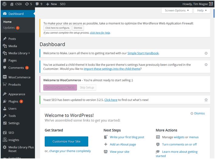
2. Your website’s dashboard.
In the left column are all of the tools you can use for managing your site
In the left column are all of the tools you can use for managing your site
Starting at the top of the column you can see where you can access your blog posts, your photos (media) and your web pages. Go ahead and click on posts to see what it looks like. Do the same for pages. Although you may not have any images yet you could also click on media to see what that resource looks like too.
Moving lower down the column you will find two other important links.
The first, ‘Appearance’ opens up a few sub menus which will allow you to customize your site. Go ahead and open up ‘appearance’ and see what the different customization options exist for you to use.
The second is ‘plugins.’ Plugins are little programs that you can download and install on your site which allow further customization. Some plugins are also tools which would allow you to do things like collect names and sell products. There are about 45,000 WordPress plug-ins to date—most of which are free. Some have a premium version for a few dollars a year.
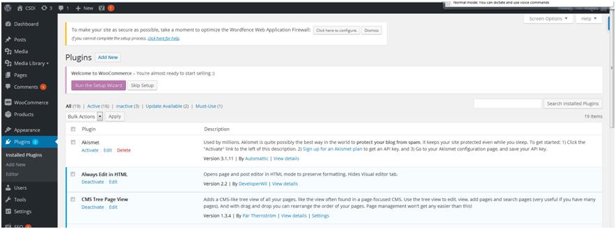
So, go ahead and click on ‘plugins’—and then ‘installed plugins’ to see what is already installed.
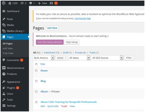
3. Opening up a finished Page.
Click on ‘pages’ and then click on ‘all pages.’
Click on ‘pages’ and then click on ‘all pages.’
Your brand-new site will probably have some blank pages already set up—such as ‘home’ and ‘blog.’ If you hover your cursor over one of these pages you’ll see that a sub menu opens up that will allow you to edit, trash, or view a page.
Tech Tool: Right click. One of the best tools around!
One of my favorite tools that I use on the computer is to right-click on things with my mouse. When you right-click on different kinds of things, new menus open up with opportunities that may otherwise be hard to find. For example, if you click on an Excel spreadsheet or a Word document you will get menu items for formatting the documents.
One of my favorite tools that I use on the computer is to right-click on things with my mouse. When you right-click on different kinds of things, new menus open up with opportunities that may otherwise be hard to find. For example, if you click on an Excel spreadsheet or a Word document you will get menu items for formatting the documents.
When you’re in the pages menu in WordPress, and you hover over a page and right-click on ‘view’ you will get a menu option which will allow you to open the new page in a new tab or a new window. That means that you can open up pages to look at them in different tabs without losing other pages in the process. So go ahead and open up a page in a new tab.
4. Opening up the finished page for editing.
When the page opens you will see a link at the top called ‘edit page.’ Right-click on that to open it in a new tab or new window and you can have both the finished webpage and the editing version of the page open at the same time like this:
When the page opens you will see a link at the top called ‘edit page.’ Right-click on that to open it in a new tab or new window and you can have both the finished webpage and the editing version of the page open at the same time like this:
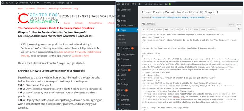
And….. if you want to copy and paste from one web page into another webpage, you can open both pages up at the same time and just copy back and forth.
Tech Tool: Dual monitors. my second favorite tool!
If you have a laptop, probably in the back is a port where you can plug in a second monitor. You can then place that second monitor on a box immediately behind your laptop so that the two monitors are positioned one above the other. This means that you can then have your original webpage and its editing page open in the top monitor, and a second webpage and its editing page open and the lower monitor so you can paste from the bottom monitor up into the top monitor. This saves the down time of opening and closing pages over and over again.
If you have a laptop, probably in the back is a port where you can plug in a second monitor. You can then place that second monitor on a box immediately behind your laptop so that the two monitors are positioned one above the other. This means that you can then have your original webpage and its editing page open in the top monitor, and a second webpage and its editing page open and the lower monitor so you can paste from the bottom monitor up into the top monitor. This saves the down time of opening and closing pages over and over again.
If you look at my photograph below, you’ll see that I have four monitors—not just two. This tremendously speeds things up.

5. Seeing where your photos are.
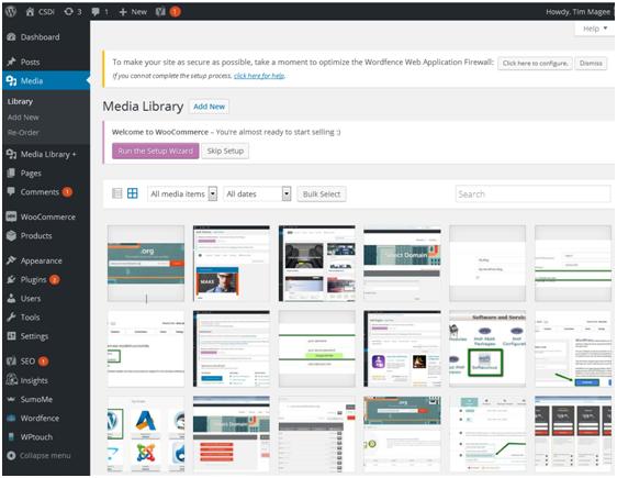
Go back to your dashboard and click on ‘Media’ and then on ‘Library.’
You can actually see all of your photos and also any documents that you may have uploaded.
Go back to your dashboard and click on ‘Media’ and then on ‘Library.’
You can actually see all of your photos and also any documents that you may have uploaded.
You can click on a photo to get information about it; you will also be able to do some minor editing like cropping or resizing.
6. Seeing where your blog posts are.
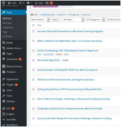
At the top of the left column in your dashboard you’ll see a link called ‘Posts’ and then ‘All Posts.’ This is just like the page view. Blog posts are kept separate from your normal webpages. Blog posts are usually chronological and so visitors can scroll down through your blog posts.
At the top of the left column in your dashboard you’ll see a link called ‘Posts’ and then ‘All Posts.’ This is just like the page view. Blog posts are kept separate from your normal webpages. Blog posts are usually chronological and so visitors can scroll down through your blog posts.
This works exactly like the pages menu. When you hover over one of the blog posts with your cursor you’ll get a menu that opens up that allow you to edit or view the post.
7. Seeing your pages in Tree View.
Tech Tool: Tree View.
I’m going to suggest installing your first plug-in called ‘CMS Tree Page View.’ Click on ‘Plugins’ and ‘Add New.’ Type ‘CMS Tree Page View’ into the search box on the upper right and you’ll see this:
Tech Tool: Tree View.
I’m going to suggest installing your first plug-in called ‘CMS Tree Page View.’ Click on ‘Plugins’ and ‘Add New.’ Type ‘CMS Tree Page View’ into the search box on the upper right and you’ll see this:
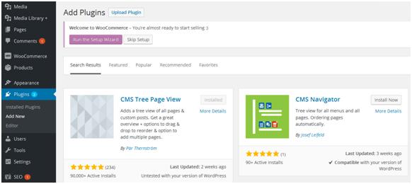
You can see the this plug-in has been installed 90,000 times and has a five star rating. Install it just like you installed the ‘One-Click Child Theme’ last week. Click on install and then activate. When you click on ‘Pages’ now you’ll have a new option besides ‘All Pages’ – you will also have ‘Tree View.’
Tree View is fantastic. It allows you to organize your pages so that similar pages are in one location—you can actually drag them around. So I’m suggesting that you download Tree View prior to beginning to create pages in Chapter 3 so you’ll start off right. It looks like this:
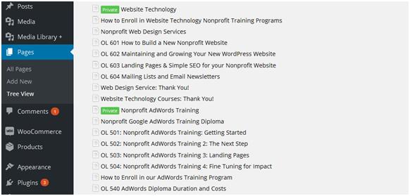
I cheated a little bit! I’ve created ‘folders’ by creating empty pages—such as ‘Web Technology’ and saving them as ‘Private’ (upper right: click on ‘visibility’ and check ‘private’). From WordPress’s standpoint, a private page is one that the public cannot see. For my purposes, creating a private page gives me nice green place holders (that just happens to say ‘private’). I can nest new pages beneath them as an organizing tool.
8. Learning where to go to customize different elements within your website.
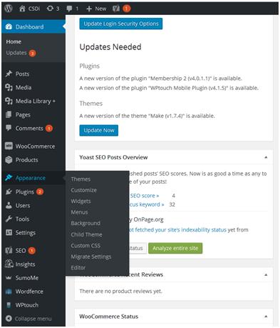
Click on ‘Appearance’ and then "Customize’ and you will see these options:
Click on ‘Appearance’ and then "Customize’ and you will see these options:
Next week, in Chapter 3, we will actually begin using these customization features to design a website. Click on one or two such as ‘General’ or ‘Typography’ to see what’s available for you. These make changes throughout your entire website. So for example, if you change the font size for your main content from 12px to 16px this will be throughout your complete website.
9. Menus, widgets, and sidebars.
Back to your left hand dashboard column. Under ‘Appearance’ click on ‘Widgets.’ For our purposes, widgets are like a small self-contained little boxes that have cool stuff in them that you can place into a sidebar or a footer area.
Back to your left hand dashboard column. Under ‘Appearance’ click on ‘Widgets.’ For our purposes, widgets are like a small self-contained little boxes that have cool stuff in them that you can place into a sidebar or a footer area.
WordPress allows you to simply drag one of the ‘Available Widgets’ into one of the sidebars or footers over on the right.
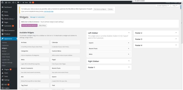
If you click on the ‘Menus’ link under ‘Appearance’ you’ll see a similar sort of a page. You can check a little box next to a webpage listed on the left and click on ‘Add to Menu’ and it will insert it into your site menu.
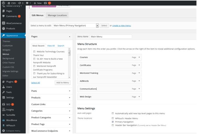
So now we had a quick tour of your dashboard and you can see how many exciting things you can do to customize your website. It’s time now to begin focusing on organizing the pages and posts in your website in preparation for adding content.
So click on the next tab called ‘Organizing Pages.’
Click here to subscribe to our newsletter and receive new chapters on a weekly basis.
Guide 5 New Pages. Design a Website: Organizing your initial pages.
Important basics: quick and easy navigation—and mobile phone friendly too
1. Quick and easy navigation.
You want your website visitors to have a good experience. You want to make it super simple for them to be able to find what they’re looking for. You also don’t want to confuse them with too much information.
You want your website visitors to have a good experience. You want to make it super simple for them to be able to find what they’re looking for. You also don’t want to confuse them with too much information.
If for example, a visitor has come to your site because they’re thinking about making a donation, you want to give them navigation choices that lead them further along the donation path. If you suddenly start introducing new concepts like volunteering, or an annual meeting, you run the risk of distracting them.
On the other hand, you want to take sure that if a potential donor does want additional information that they can find it easily.
2. Mobile Friendly.
When you were choosing the theme that you’re using on WordPress, we talked about making sure that your new theme was mobile friendly—or responsive. So this probably already taken care of.
When you were choosing the theme that you’re using on WordPress, we talked about making sure that your new theme was mobile friendly—or responsive. So this probably already taken care of.
Where it comes into play during page organization is in keeping your pages somewhat simple so that a person on a smart phone can make sense of a reduced-size page.
It also relates to the menus along the top of your pages: what happens to them when the page is made much smaller? Can a visitor still find the menu? Are the fonts on your webpage large enough so that they are legible to person on a smart phone? Are the donate buttons large enough so that a person on a smart phone can indeed activate the button. So over the next few weeks simply keep these kinds of things in mind as you’re making decisions about how your website is organized.
3. Organizing your initial pages: Keep the structure simple—but plan for growth.
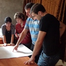
Getting Started. One thing that I would suggest you do, would be to take sheets of paper or 3 x 5 cards, and begin making notes on them for main pages that you would like to have. This could include things like home, blog, donate, volunteer, subscribe and about.
These could be taped to a wall with space around them or you can add additional cards beneath each category. You can get a good sense of how your website is laid out this way, and you can even use arrows or bits of string to show the relationship between one page that a visitor is on and a second page or third page that they might like to get to for additional information. This should be easy for them to do.
Start Simple. Once your main pages are organized on a wall or table, over the next few weeks as you begin thinking up new pages you would like to add, you can start organizing the new pages on their own cards beneath the main menu cards.
Take the opportunity at some point to stand back and see if it’s all making sense. If you start with a very simple layout, you will be able to spot problems quickly and fix them easily.
You may see that there are some pages which can perform double duty—rather than writing a page on ongoing programs for your donors and a second for your volunteers—you might be able to have one page on ongoing programs which both donors and volunteers could access.
So begin thinking today about a few main themes that you want to feature in your website.
These main pages may likely become the pages in the menu at the top of your webpage.
They could also represent the organizational pages in your tree view. So your menus and the way your pages are laid out in tree view would be the same.
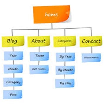
An Example:
Here is an example of one way to organize pages. Although this is for our training courses, for your purposes, the headings could just as easily say ‘Ways to Donate’ or ‘Children’s Programs’ and then you could organize related pages nested underneath.
Here is an example of one way to organize pages. Although this is for our training courses, for your purposes, the headings could just as easily say ‘Ways to Donate’ or ‘Children’s Programs’ and then you could organize related pages nested underneath.
Tech Tool: Go to your computer and open up the place where your files are stored (this could be Windows Explorer or Apple iCloud—whatever). Create the exact same structure as you have in tree view. This will be extremely useful for storing Word documents that you’re going to copy and paste into your website.
Why? In six months you are not going to remember exactly what it was that you wrote as a draft webpage—or where it is stored. Maybe you had some notes or alternate ways of phrasing things that could be useful in the future. Maybe you did some research and found a paper that you quoted on a webpage: store it with your draft webpages.
Also, from a team approach, you never know when you might get that big promotion and a new person comes in and takes your spot. This way they can easily find things.
So here’s what you could wind up with. Compare it to the tree view above:
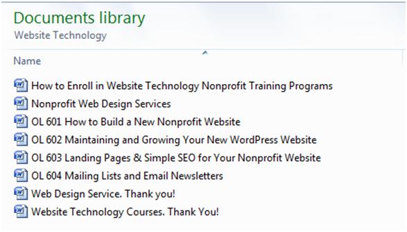
In a year, when you wind up with 100 pages—they can be difficult to find! Organized in this manner—in tree view—makes them much easier to find.
Tech Tool: If you can’t find a page—here is an ultra simple trick. From your Dashboard, open up ‘Posts’ or ‘Pages.’ From your keyboard enter ‘control F.’ A little cell will open up in the lower left corner of the webpage. Enter a word that is in the page title you are looking for and this little wizard will find it in the list of pages or posts.
In summary, keep it simple. Choose your main pages (those pages that you might like to have in your menu). Write them onto 3 x 5 cards and tape these to a wall. Add related pages beneath these. See if there is duplicity that could be simplified. Start building your website tree view with the same structure. Do the same with your Word files and folders.
Click here to subscribe to our newsletter and receive new chapters on a weekly basis.
Guide 6 Simple SEO. Setting the Stage for a Google Search.
Make including these ultra-simple Google search magnets into your initial pages a habit now.
This is the last section in this week’s chapter. We are going to be covering SEO in more detail in Chapter 5. But today, my goal is to get you into the habit of doing some very simple, basic Search Engine Optimization (SEO) each time you create a new page or new blog post on your website.
The reason for this, is that if you enthusiastically paste in 15 or 20 pages into your new website, and don’t do some simple SEO work, you’ll be facing a huge mountain of work to bring those 15 or 20 pages up to snuff in the future. Also, you might make some simple mistakes that will be difficult to correct later. So let’s get started so that you will be fully prepared for next week’s Chapter 3 where we will begin creating pages.
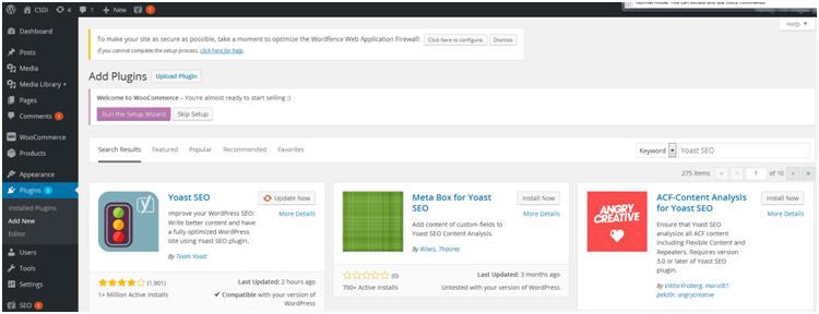
Step One. Return to ‘Plugins’ and ‘Add New’. Type "Yoast SEO’ into the search box. You can see that they’ve had more than 1 million installations. Go ahead and install and activate the plugin.
Step Two. I’m going to create a fictitious newsletter subscription page. This will let you see some of the problems that can evolve—and can show you some very simple ways to correct them.
Here’s what the new page looks like in HTML edit mode:
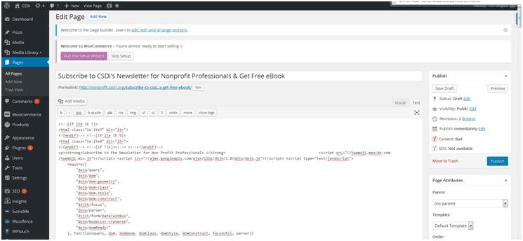
Couple of very interesting things here.
First, is that off to the right, after you’ve created the page, you have the option of publishing it or saving it as a draft. Always, always save new pages as a draft until you have completed this SEO step. If you click on publish, the address for this page (the URL) is published too—and you might want to modify the URL during the SEO optimization.
Secondly, you can also see how long the page title is, and how long the URL is. Also, you can see a bunch of gobbledygook in the HTML which is code from the email subscription form: it has nothing to do with the text which will be visible in the finished webpage.
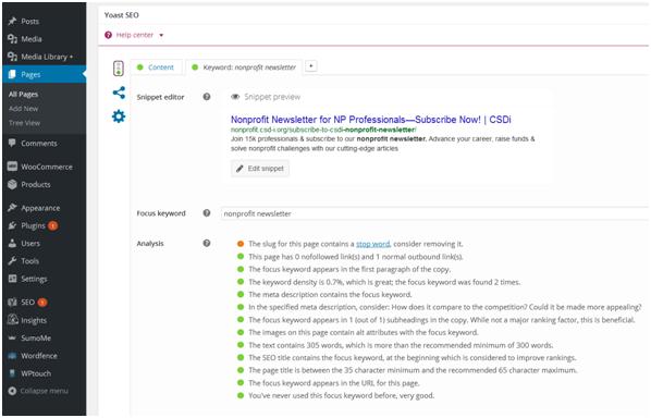
So now let’s see what Yoast does for us. This is going to be quick since going to cover much of this in greater detail in Chapter 5. While still in the edit mode you can scroll down and find this information:
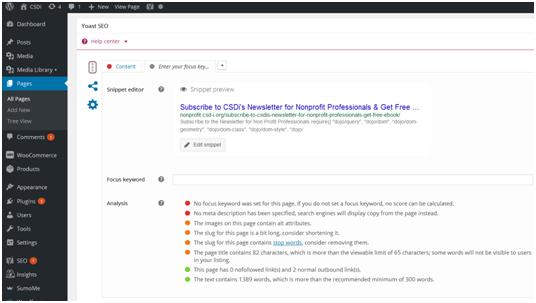
The first things that Yoast shows us is what a Google search result would look like for this page. You can see that the page title is much too long—so that it is cut off midsentence. Secondly, although descriptive, the URL is quite long too. And lastly the page description is the HTML gobbledygook that has been automatically uploaded from the webpage. Makes no sense whatsoever.
The second thing that Yoast does for us is to point out some problems (marked with red and yellow bullets) so that we can fix them; the fixes can be done right away in edit mode. If later you want to improve the modifications, all of them can also be changed again later—except for the URL.
1. Page Description.
Yoast suggests that we write a (meta) description. An introductory paragraph from your web page might be just the ticket here. They suggest limiting the description to 156 characters (including spaces). Yoast will tell you when you exceed that limit.
Tech Tool: Another trick is to simply select your introductory paragraph in Word. In the lower left-hand corner of your Word document is a little cell called ‘Words.’ Click on that and it will tell you exactly how many characters (with spaces) you have so that you can edit your text down to 156. We will be using this trick a lot in the AdWords chapters!
NB. Please remember that during this process to always save your work as a draft: don’t publish yet because of the URL.
2. Focus Keyword.
The next thing to do is to determine a focus keyword (or phrase). This will be the main concept that you’re trying to convey in this webpage. It can be one or two words long—and this will be a major signal for Google when they’re searching for a match.
Tech Tool: A quick trick that you can do to find a good focus keyword is to make an initial decision what your focus keyword might be. In my case it could be ‘nonprofit email newsletter.’
Enter this into a Google search and see what comes up—especially in the three or four ads which will appear at the very top of the search. Both the ads and the top search results just below the ads may have been written professionally. That’s why they made it to the top! You might find that in the titles of the search results they are using a keyword which appears to work well for them that you could incorporate in with your focus keyword.
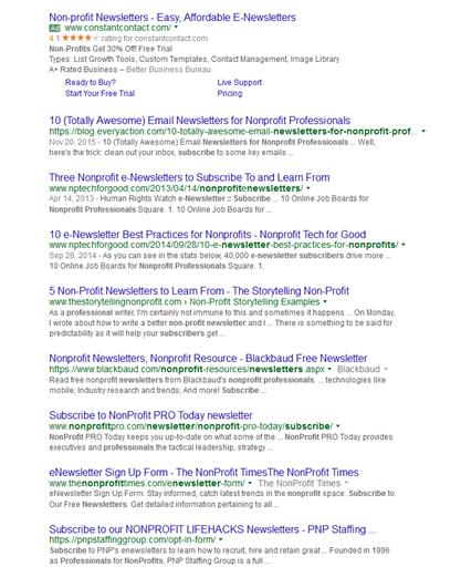
In my case ‘nonprofit email newsletter’ turned up a number of search results that were actually shortened to ‘nonprofit newsletter.’ Words like ‘subscribe’ and ‘professional’ also appeared. So I decided to go with ‘nonprofit newsletter’ as my focus keyword and then think of a shorter page title that included ‘nonprofit newsletter’ plus also ‘subscribe’ and ‘professional.’
Page Title: I came up with this: “The Nonprofit Newsletter for NP Professionals—Subscribe Now!”
URL: I also shortened my URL so that it’s simple and short—but also descriptive.
Page (meta) Description: I then copied a couple sentences for my introduction and pasted them into the description ‘snippet’. “Join 15k professionals & subscribe to our nonprofit newsletter. Advance your career, raise funds & solve nonprofit challenges with our cutting-edge articles” (exactly 156 characters).
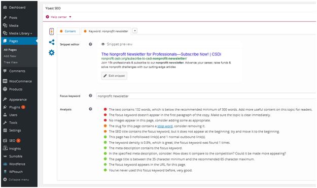
You can see that my focus keyword appears in the page title, the URL, and in the short description. Yoast then came up with a few new suggestions. Hmmm. The first is that the text was a bit short in the webpage itself. So I added a few paragraphs that I copied and pasted about the benefits of subscribing. That’s solved that problem.
The focus keyword didn’t appear in the first paragraph of the webpage’s copy—so I reworded the first paragraph a little bit so that it was included: “Thank you for joining 15,000 professionals who subscribe to our nonprofit newsletter.”
Finally, they suggest that the page title didn’t have the focus keyword at the very beginning of the title. Sometimes this is difficult to avoid—but in my situation I was simply able to remove the word ‘The.’
A Small Challenge: When you customize your website next week in Chapter 3, WordPress will ask for a ‘site title.’ Usually this is the name of your organization. But you can see in the illustration below that Google will automatically add that site title to the search results. Since Yoast recommends a maximum of 65 characters, the length of your site title reduces the number of characters that will show in the page title on the Google Search results.
So, in our case, CSDi (with spaces) reduces the 65 available page title characters down to 58. 58 is the maximum number of characters that will show in the search results for the webpage title. Consequently, when you put in your site title next week in Chapter 3, you might want to go for short version for now. We chose CSDi rather than ‘The Center for Sustainable Development’ for this very reason.
Here is what the final Yoast analysis shows:
Okay, we’re done with simple SEO for this chapter—again we are going to revisit SEO in greater detail in a couple of weeks. This was just for you to begin developing the habit of taking 15 minutes for SEO right when you post a new page. This will save your having to face doing this to 20 pages at some point in the future. Plus you can avoid challenges that might be difficult to fix later.
You are done! Now, it’s time to design a website and get busy with the fun stuff: branding, adding a logo, creating new pages and adding content in Chapter 3.
|
Click here to get the Beginner’s Guide to Online Donations.
|
|
In the next chapter (Chapter 3) we will begin furnishing your new website: branding, adding a logo, creating new pages and adding content.
Enjoy. See you next week.
Design a Website. Want to enjoy this chapter’s learning process with a teacher? See the online, teacher-led course behind this chapter.
|
Get free access to the Beginner’s Guide to Online Donations here. Each of the 14 chapters includes 3 individual, step-by-step guides to boosting online fundraising: 42 guides in total. See the syllabus.
|
|
Copyright © 2016, Tim Magee